Howdy!
Just wanted to share my last two works, both of which are available as signatures in an MMO-Champion Friendly Style. The originals can also be re-sized for any other forums you may frequent. I'll only post the MMO-Champion friendly ones here so I don't kill anyone's interwebz!
If you want one personalized with your name, and maybe a snazzy little logo, just send me a PM. Also, If you have an Idea for a image or signature you would like me to make for you, again, just PM!
The Hat: I made this one already after someones avatar here inspired me!
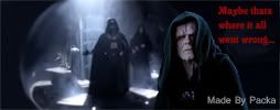
The Emperor Remembers: I made this one today, had the idea on the bus.
All my originals can be found here:
http://packadurm.deviantart.com/
-
2010-11-10, 06:41 PM #1
Want Crtique for my artwork / Signatures!
-
2010-11-10, 06:42 PM #2Keyboard Turner


- Join Date
- Nov 2010
- Posts
- 7
Its spelled Critique afaik
-
2010-11-10, 06:44 PM #3
Eh, there's no I in Team... or something. Thats what happens when I rush, I guess. Maybe a mod would add the I for me? <3
-
2010-11-10, 06:44 PM #4Pandaren Monk


- Join Date
- Jun 2009
- Location
- Sweden
- Posts
- 1,777
-
2010-11-10, 06:51 PM #5
They're a bit... strange.
-
2010-11-10, 06:59 PM #6
Strange? In what way?
I took a different turn for these two, as opposed to my usually work. do they seem strange because a certain part stands out in a weird way? Or are they just strange in general when compared to the majority of sigs here on MMO-C?
-
2010-11-10, 07:01 PM #7Bloodsail Admiral


- Join Date
- Apr 2010
- Location
- hAntwearpen
- Posts
- 1,132
the first one made me smile, plz more of those
 ∞=0
∞=0
0/2 = 0 , ∞/2 = ∞
2/0 = error , 2/∞ = error
0*2 = 0 , ∞*2 = ∞
-
2010-11-10, 07:02 PM #8
Maybe use white text on the Darth Vader one, though I don't really find either of them that funny. <.< Sorry bud.
-
2010-11-10, 07:03 PM #9
Ah well... They look like screenshots with basic captions on them. Text is justified (is that what you call it? I think, I mean, I haven't had an English class in 10 years...) to the left, and well... It just, isn't what comes to mind when I think of signatures. Reminds me more of Lolcats. Pictures with captions, no thought on placement or font or composition.
Edit: Also my sense of humor broke when I was born so... I can't really comment on the context of the sigs. >_>
-
2010-11-10, 07:08 PM #10
Looks like epic fail to me, but hey, im no artist
 That is not dead which can eternal lie, and with strange Aeons even Death may die.
-
2010-11-10, 07:09 PM #11
I also have no sense of humor, :K
Your right about the text justification, something I overlooked. I also find the fonts a little boring, but Ehhhhh
The first one was a simple cut out of one character and pasting it on to a still image with the other on it, like you guessed. The second, however, was edited a fair bit. Its just hard to see with the small image size.
I'm quite open if anyone can think of something funnier to put on them
Its great that you think they are an epic fail, but I wasn't asking if they win or fail. I was asking for opinions, which you really don't have to be an artist to provide.
-
2010-11-10, 07:18 PM #12
Ohh, yah I can kinda imagine the editing now. I never really watched Star Wars so my first thought was it's just a screenshot. Haha. Font has always been a huge pain for me as well. I gave up on finding one for my sig. x_x As for positioning, I can imagine the "Maybe..." top left corner, than bottom centered "That's where it all went wrong...", minus the ".
For the other sig, I just. My mind goes blank. >_> I feel like I'm missing some important reference when I see it and I feel bad for not being in the know... Maybe, re-cut it so the hat guy is in the center, and adjust the font so it doesn't overlap with the two characters. I found myself reading the font before even focusing on the image itself so I think that blocks up the process of taking it all in.
I think I made sense. I hope I did. Anyways major props for being willing to post on the forums and ask, some scary wolves out there when it comes to critiques.
Edit: Yah I was looking at the first sig some more. I think like, the text is refering to the guy in the hat, right? But he's covered up by half the text, where as the guy pointing at him is lit up and pointing. All the focus goes to him instead of the subject of the sig so that throws it off I think. Maybe adjusting the lighting/contrast on the hat guy along with repositioning him within the sig so he's front and center. if you elongate the space to the right, you might be able to fit all the text in there, allowing you to see the image, focus on the silly hat guy, then read the caption. o.o ..maybe? Might work...Last edited by Solfire; 2010-11-10 at 07:24 PM.

-
2010-11-10, 07:29 PM #13
I agree with what ya saying, Ill try some of your ideas once i get out of my next class!
and while there may be lots of bad wolves on forums like this, I need to brave them so I can get good critique form people like you. If i ever want to improve that's a step I have to take; I have to assume my opinion is biased.
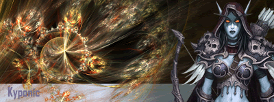
Here's an old forum sig I used, its probably more of a traditional style. The 2 images in my first post are more of a funny-pic style than forums sig, I guess, but I still rather liked 'em
-
2010-11-10, 07:43 PM #14
Ah yes, that sig makes more sense to me.
 I guess this means I fall under traditional. Darnit.. I want to be eccentric not traditional! D: Where did you get the image for the fiery..glowy..shiny swirly thing-e-majigger? Looks like vector (swirly) meets contemporary (bottom line + text) meets traditional art. o_o

-
2010-11-10, 11:00 PM #15
http://planetrenders.net/
Its a site I usually get most of my 'foreground' images from, such as that pic of Sylvanas and the swirly thing. Most, if not all, of the images on there have no background to them, making it very handy for working with photoshop. Although, it can get real annoying when you cant find what your looking for :d so I have started to cut out my own images, when I cant get one I want.
---------- Post added 2010-11-10 at 11:41 PM ----------
I reworked the text, and moved it around using your suggestion... and it DOES look much better now
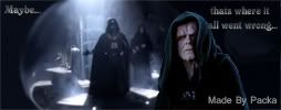
I removed the persons name to give me more space, then re arranged the text. has a much better flow now!
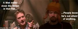
Of course, both look much better in a bigger, non-MMO-C Friendly size. although, that second one now takes up ~53Kb, over the maximum of 50Kb. Before I removed some stuff, it was 47Kb..l think something funny is happening here!

 Recent Blue Posts
 Recent Forum Posts
 Blizzard as the only news source, why is that?
 Developer Thoughts - Plunderstorm Game Mode and Feedback
 Rank the Dragonflight Dungeons (beyond knee-jerk reactions)
 MMO-Champion



 Reply With Quote


