New Website Design - Feedback Needed!
My lovely new tech team is working on a new design for the site and I figured it could be nice to ask for your opinion while things are still in development. There is a dedicated post on the Suggestions & Feedback forum where you can give your opinion and complain about the annoying things before it goes live.
Important
- No, we're not reducing the amount of news posts on the front page to 2, it will remain the same old super-long front page.
- I'm mostly looking for people who have good idea on how to improve things, if you really hate something try to elaborate and offer ways to do things better. (Please post in the Feedback Thread)
- It's a 1680x1050 screenshot because this is the most used resolution on the website, it should work fine on lower res.
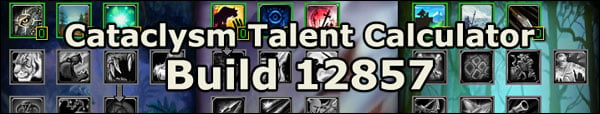
WoWTal.com Updated to Build 12857
Had a few hiccups with the latest build because of the server migration but the
cataclysm talent calculator is now updated to the latest beta build.
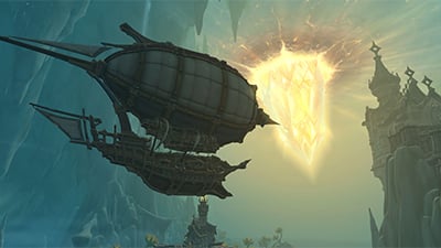
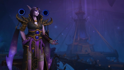
New Race Introduction Cinematics
TotalBiscuit compiled all the new introduction cinematics added to the game in the latest beta build. All races character creation cinematics have been updated to reflect all the recent changes to the lore, including upcoming changes, and you might want to check them out.
Disclaimer: There are a couple of major spoilers there
Cataclysm Glyphs
Originally Posted by
Ghostcrawler
(
Blue Tracker)
Prime glyphs aren't going to be exciting in a "change up your rotation" style. We want primes to be unambiguous dps (etc.) increases so we figured they might as well be easy to understand rather than something so convoluted that everyone would just go to a fansite to see which 3 to pick.
The majors are more interesting, because they are either not dps increases at all, or dps increases in ways that are tricky to math out. We think players will debate and geek out more about which majors to use, and with the new glyph design, swapping them out once in awhile isn't very painful.
Minors are basically convenience or fun.
We don't want glyphs to change rotations. We feel that was a mistake in LK. Talents should affect your rotations, and glyphs should just provide a little bit of customization and power. We fixed some class problems with glyphs in LK, which was an easy solution to do at the time, but now is the time to undo all of that and let the classes stand on their own without the glyphs.
I'm not sure I agree with this. I can understand wanting to keep it simple, but like someone else said, if you're going to have 3 glyphs that we're always going to have with no variation, and none of them have any effect on the rotation... couldn't we just stick with minor/major glyphs, and just remove the prime glyphs entirely?
First, it would be a weird world in which a warrior say could glyph Charge and Battle Shout but not Mortal Strike. It might make sense to savvy players who thought through it, but I'd wager you'd also see a lot of "Why don't they make glyphs that affect the buttons I care most about? Blizzard is dumb." (And to be clear, the point of that is not to defend ourselves against agitated forum posters, but that if something in the game is confusing like that in can get in the way of having fun.)
Second, gaining power when you level up is fun. Hitting a milestone where you get a noticeable damage bonus is fun. There is also some mildly interesting decisions about which prime glyph to use first. In other words, don't view everything through the lens of the maximum level player.
Third, not everything in the game needs to be a nail-biting decision. We don't for example really want Fury warriors to stress about whether to choose Raging Blow or not, nor we do we make it particularly challenging to choose your weapon enchant. Sometimes easy decisions make players feel more comfortable rather than every potential decision having a host of invisible pitfalls. This isn't an issue of catering to the dumb players -- it's more about there being a few safe places in the game. [I feel nearly certain after re-reading that paragraph that it's going to be hard to understand and I will end up having to clarify it for months to come.]
Finally, I'd argue that the popular glyphs on live today already were the no brainers because in most cases they led to a consistent dps increase (for dps specs of course). When everyone uses those glyphs, then you aren't making some interesting decision about how to use your abilities -- you're just doing what every other warrior out there is doing. The only way to deviate from that is to have two glyphs that affect your primary abilities in two totally different but equal ways. That's a very tall order, because more than likely we'll end up having to constantly adjust around that. "Encounter #4 in Grim Batol is unfair to warriors who use the Glyph of Furious Mortal Strikes instead of the Glyph of Meaty Mortal Strikes." What I mean is that we end up having to support multiple play styles within one tree. We're willing to do that to a limited extent (the TG vs. SMF Fury warrior for example, or the FFB mage), but it's hard enough to develop 1-2 viable rotations per spec. We don't want every important glyph bifurcating that rotation even more.
Blue Posts
Originally Posted by Blizzard Entertainment
Your ICC gear is going away in Uldum (LVL 84-85)
What gear? Uldum has zero quest rewards and the creatures are not itemized. When Uldum is itemized every single quest should offer you an upgrade, regardless of what gear you have from ICC+. (
Source)
 Paladin
 (
Forums /
3.3.5 Talent Calculator /
Cataclysm Talent Calculator /
Beta Skills/Talents)
Paladin Glyphs
That Avenging Wrath glyph no longer exists. It's far too obvious a dps increase to be a major under the new paradigm.
The Seal of Truth one is on the bubble. It's still in for now, but it's pretty much a no-brainer given the stat savings it offers. (
Source)
Selfless Healer
We're fine with Selfless Healer. It's not going anywhere. We are slightly sympathetic to the concern that the opportunity cost is too high given that you're giving up a Templar's Verdict and that's the kind of thing we might mess with. However, if the idea of having a talent focused solely on healing (and not self preservation) offends you, then skip the talent. It's intended to be optional. There are paladins out there who like the concept of being able to help out healing in a 5-player dungeon or like being able to save lives once in awhile, and the talent is aimed at them. (
Source)
 Warrior
 (
Forums /
3.3.5 Talent Calculator /
Cataclysm Talent Calculator /
Beta Skills/Talents)
Warrior Glyphs
Some of those glyphs don't look correct. Colossus Smash is a major. Hamstring doesn't do that anymore. Shield Wall provides 60% damage reduction but on a longer cooldown. That's just off the top of my head. (
Source)
Published on 2010-09-03 06:49 AM
 Build of the Month
 Recent Blue Posts
 Limited PvP -> PvE Free Character Transfers
 The Cataclysm Classic Pre-Expansion Patch Arrives April 30
 Recent Forum Posts
 Season 4... Just old dungeons and new ilvl?
 Hide "earned by" on Achievements
 Did Blizzard just hotfix an ilvl requirement onto Awakened LFR?


vBulletin Message