Limited PvP -> PvE Free Character Transfers
 Mythic+ Dungeon Adjustments - 27 April
 Best Villain in the History of WoW
 MMO-Champion
Here we go. A month old pic from Atramedes hc. Some small modifications after that but nothing major.
 Recent Blue Posts
 Recent Forum Posts
Thread: Post Your UI
-
2011-05-21, 12:12 AM #4141Deleted
Last edited by lawomous; 2011-05-21 at 12:31 AM.
-
2011-05-21, 02:03 AM #4142High Overlord


- Join Date
- Jul 2010
- Posts
- 105
I like this. A lot. How get? Originally Posted by Coldasice


-
2011-05-21, 02:56 AM #4143High Overlord

- Join Date
- May 2010
- Posts
- 136
Just for starters, I love the look of your UI, especially directly near the bottom. Only thing I saw right off the bat I would want to add in where the recount is, to somehow manage to slide in omen in that box, as I find that very useful, some dont just my thoughts. Originally Posted by Solfire
ive got two questions for you, at the top you have your buffs over what appears to be "a black bar". What is that black bar? Other question is how did you design the bottom half of your UI, not so much the bars and chat box, but what they are in, I can never think of the proper word. the panels.
-
2011-05-21, 06:35 AM #4144Stood in the Fire
- Join Date
- Oct 2009
- Posts
- 376
http://www.tukui.org/forums/topic.php?id=12138 Originally Posted by Rennalt
-
2011-05-21, 08:28 AM #4145Over 9000!

- Join Date
- Apr 2010
- Location
- Moonglade
- Posts
- 9,407
A ViewPort can do the black bar. Viewporter is the smallest and probably simplest version around. Originally Posted by Kryptomaniac
KgPanels can do the second bit, or SunArt. There's a number of Art panel additions. Might be custom made or he might be using one of those.
-
2011-05-21, 09:49 AM #4146Bloodsail Admiral


- Join Date
- Dec 2008
- Posts
- 1,001

I'll edit with a Raid SS once I get a hold of one.Last edited by mmocba105e19de; 2011-05-21 at 10:26 AM.
-
2011-05-21, 09:07 PM #4147Blademaster

- Join Date
- Feb 2011
- Posts
- 45
Here are a few screens I took of my UI.


I hope I did the linking correctly..
-
2011-05-21, 09:39 PM #4148Grunt
- Join Date
- May 2011
- Posts
- 19
LucashUI
Simple, plain UI made by myself. It seems way darker in the screenshots tho.
Idle:

Combat:
http://i52.tinypic.com/2mqw1dy.jpg <-- clicky
-
2011-05-21, 09:58 PM #4149Warchief

- Join Date
- Jan 2011
- Posts
- 2,085
Old pic but basically the same. I like what Blizz did with the UI frames.


-
2011-05-22, 05:09 AM #4150Stood in the Fire
- Join Date
- Sep 2008
- Posts
- 441
Adding some Ish flavor to the transparent UF idea floating about.
http://imageshack.us/m/828/3324/tranny.jpg
<3
-
2011-05-22, 05:12 AM #4151Dreadlord
- Join Date
- Dec 2010
- Posts
- 966
For a second I was hesitant to open that. Originally Posted by Ishtara
-
2011-05-22, 07:39 AM #4152Epic!
- Join Date
- Jul 2010
- Location
- United Kingdom
- Posts
- 1,661
I'm not a fan of the unit frames if I'm honest, the whole transparent thing just erks me. Originally Posted by Ishtara
I don't understand why people can't use a simple health bar >_<.
-
2011-05-22, 01:02 PM #4153DeletedI really need to know the Name of the Font and Addon you use for your bottom bar (time,fps,etc) ! Originally Posted by Ishtara
-
2011-05-22, 04:38 PM #4154Stood in the Fire
- Join Date
- Sep 2008
- Posts
- 441
Because simple health bars are boring and WoW is boring enough as it is without adding in boring Ui elements Originally Posted by carebear

-
2011-05-22, 08:05 PM #4155Mechagnome
- Join Date
- Nov 2010
- Posts
- 623
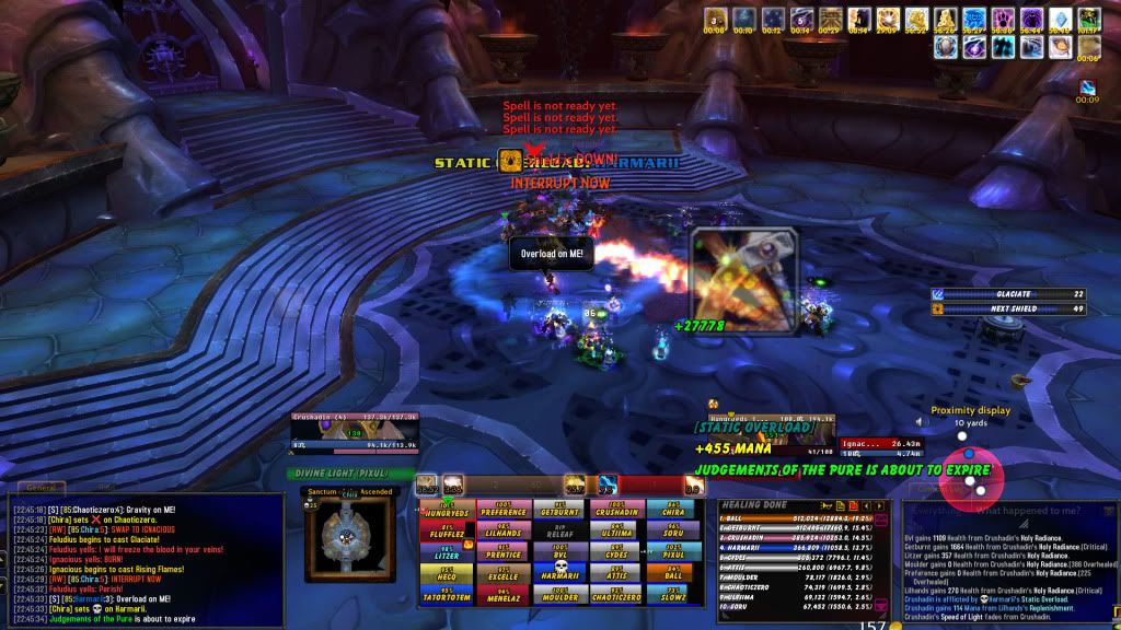
Are you combining that with Clique? Or are you actually clicking a players name then hitting a heal?
Here's mine

Hidden here are power auras (besides Judge) they rotate in a circle around my character. And for some reason in the SS, my notifications "Mana Gained, Judgements of Pure about to expire, and Static Overload" plus my proximity monitor are all shifted to the right, they are actually in the corner more-so, so they do not overlap my unitframe and combat textLast edited by mmocba105e19de; 2011-05-22 at 08:28 PM.
-
2011-05-22, 08:08 PM #4156Mechagnome
- Join Date
- Nov 2010
- Posts
- 623
Here is mine, completely made from scratch
Hidden here are power auras (besides Judge) they rotate in a circle around my character. And for some reason in the SS, my notifications "Mana Gained, Judgements of Pure about to expire, and Static Overload" plus my proximity monitor are all shifted to the right, they are actually in the corner more-so, so they do not overlap my unitframe and combat textLast edited by mmocba105e19de; 2011-05-22 at 08:29 PM.
-
2011-05-23, 02:19 AM #4157High Overlord

- Join Date
- Oct 2010
- Location
- Australia
- Posts
- 118
lol I just clicked without reading entire link, that could have done some scarring..... Originally Posted by Fazdran

-
2011-05-23, 02:19 AM #4158Dreadlord

- Join Date
- Sep 2010
- Posts
- 955

Last edited by mmocba105e19de; 2011-05-23 at 08:37 AM.
-
2011-05-23, 07:04 AM #4159High Overlord
- Join Date
- May 2010
- Posts
- 136
ive seen these proximity monitors in multiple pictures now, and just recently in one of tankspots own uber-priest Aliana... what add-on is this that has the small box like monitor that shows the proximity of other players. Can I get a link please and thank you, I love the idea of it.
-
2011-05-23, 07:09 AM #4160Epic!
- Join Date
- Jul 2010
- Location
- United Kingdom
- Posts
- 1,661
I just don't understand why unit frames need to be all complicated though. Your unit frames aren't the worst, I'm just talking in general here. I don't see why people go and put silly fonts on them, and then a little squiggly bit here, with a random box here and then some transparency to make them see through. It just makes it look a lot worse than it would be if there was a health bar, with a portrait and an elegant font that fits well. I just find a nice simple set of unit frames a lot more fitting and well suited. Originally Posted by Ishtara
Any chance we could get a screenshot with something happening? Originally Posted by Moriat


 Reply With Quote