Confront Xal’atath When Dark Heart Arrives on May 7
 Dragonflight: Dark Heart Content Update Notes
 Dragonflight: Dark Heart Content Update Notes
 Rank the Dragonflight Dungeons (beyond knee-jerk reactions)
 MMO-Champion


I'm curious on how did you create the buttons, would be n1 to use this for my UI too
 Recent Blue Posts
 Recent Forum Posts
Thread: Post Your UI
-
2012-02-14, 06:57 PM #6361The Patient

- Join Date
- Jan 2009
- Posts
- 201
-
2012-02-14, 08:58 PM #6362The Patient

- Join Date
- Aug 2010
- Posts
- 220
Make sure you dont use Wowmatrix and have erased all files of that contained in every single addon. My Ui wasnt accepted 3times in a row due to this problem i didnt knew. I knew about the fact that you arent alowed to use wowmatrix but not that it inserts files into every addon you update via it. Originally Posted by Muncken87

-
2012-02-14, 09:26 PM #6363The Unstoppable Force

- Join Date
- Apr 2009
- Posts
- 22,348
Handing it out to a smaller audience may not be a bad thing either, since I have seen how demanding a larger one can get regarding "tweaks" which may suit a few as a single individual.
-
2012-02-14, 09:28 PM #6364Deleted
I actually sent them a mail, and it wasnt wowmatrix it was something like that i didnt put a info file in the rar, even though i had an installation on the mainpage.
---------- Post added 2012-02-14 at 10:30 PM ----------
I can agree with that, if u tweak alot, and maybe it feels easier to give it to ppl that got some knowledge how to change things so u dont have to be a support if u would have put it on wowinterface. Originally Posted by ComputerNerd
-
2012-02-15, 05:18 AM #6365High Overlord

- Join Date
- Jul 2009
- Posts
- 122
They just recently stopped allowing files to be in .rar format because their updater can't download new updates with archives in that format. ZIP it up and you should be good to go.
-
2012-02-15, 06:30 PM #6366DeletedI actually zipped it and pretty much did what they said in the faq, but when i wrote to them it seemed like they had no clue why it was declined :P Originally Posted by Quse
-
2012-02-16, 01:40 AM #6367Deleted
Don't see the point in having the time in a UI.
-
2012-02-16, 02:21 AM #6368Mechagnome

- Join Date
- Apr 2010
- Location
- Graveyard
- Posts
- 660
I don't see the point in commenting something negative like that. Originally Posted by Zumo

When a wild forum troll appears
-
2012-02-16, 04:34 AM #6369Stood in the Fire
- Join Date
- Sep 2008
- Posts
- 441
Either Originally Posted by Zumo
A. You don't speak English well and you are trying to say that you don't see the point in spending time making a custom Ui.
OR
B. You do speak English and you can't understand why someone would want a clock in their Ui to know what time it is.
If A: Your post is completely pointless.
If B: Some people like to keep track of time while playing WoW.
-
2012-02-16, 04:58 AM #6370High Overlord
- Join Date
- Jul 2009
- Posts
- 122
People that play full screened don't have a clock in the bottom right corner of their screen. Originally Posted by Zumo
Newest update:
DPS layout

Heal/General layout

LinkLast edited by mmocba105e19de; 2012-02-16 at 06:28 AM.
-
2012-02-16, 08:58 AM #6371High Overlord
- Join Date
- Sep 2010
- Location
- Atlanta, GA
- Posts
- 191

 Information displayed by any user interface needs to be able to be gleaned from a quick glance. Any pixel fonts other than Semplice and two or three others unfortunately do not have this characteristic. Vital information should never be displayed at anything even close to 8pt. Just look at any commercial or professional interface ever designed from a cellphone interface to any other popular game interface to a web interface, they almost all use a crisp, clean sans serif for this very reason. Attempting to argue that the majority of pixel fonts, or any pixel fonts (other than the few exceptions) for this matter, are perfectly fine in this regard and are well suited for use in an interface design is futile and only strengthens the idea that one has no idea what he or she is talking about and consequently all ideas and arguments made by this person should be disregarded off the bat. Originally Posted by Ishtara
And here's something I've been working on - sort of a minimalist concept showing lb/pb/ignite dots and an edited myBigIgnite frame in the center of the player frame with the power bar overlaying the border of each frame:

Last edited by tenub; 2012-02-16 at 09:06 AM.

-
2012-02-16, 09:26 AM #6372High Overlord
- Join Date
- Jul 2009
- Posts
- 122
I sincerely believe you're missing the font scale of some pixel fonts at 8px. A post above yours is my interface with a completely and 100% readable at-a-glance pixel font that is 8px. There is nothing difficult to read, its easily large enough to get information from - in fact, there isn't a single bit of vital information in that interface (aside from chat font) that isn't in the pixel font at 8px. I've spent an innumerable amount of hours browsing pixel/bitmap fonts, and aside from seriously stylized fonts, most are completely acceptable for interfaces that strive to, and are, easily readable.
While I agree that "some" pixel fonts are ineffective for "at-a-glance" information, there really aren't that many in use by completely and easily functionable interfaces - including Ish's (even though I don't care for his).
Edit for Treeston:
Did I miss the option for a smaller thumbnail on imgur that doesn't require a paid sub? I thought I linked in the smallest I could get =/
-
2012-02-16, 10:38 AM #6373DeletedI wonder, your combat log / EavesDrop thing on the right side, while it looks pretty and organized, do you ever actually use it in the middle of a battle? Originally Posted by Quse
-
2012-02-16, 10:41 AM #6374DeletedThe last character of thumbnail specifies thumbnail size. Originally Posted by Quse
Is a medium size thumbnail, for example. Other valid values are "l" and "s" (large and small, respectively). You can omit it to link to the full-size image (inside the [url=] tag).Code:http://i.imgur.com/hTluVm.jpg
-
2012-02-16, 11:05 AM #6375High Overlord
- Join Date
- Jul 2009
- Posts
- 122
(this might be a double post, I swear I just hit submit)
re: Ish
You're right, I don't use it as much as I thought I'd use it. But I've used scrolling combat texts (MSBT, xCT, etc..) and it essentially filled the need but I was able to look back through it - "insta-gibbed? oh hey this is what happened," and I hate the default combat log for that purpose. I've been ramping up the healing/damage thresholds to make it less spammy and only show the inc dmg that I'd like to see (which is almost exclusively what I'm suing it for).
I could in all reality find some way to hide unless moused over or faded out, but I think I'd miss it too much. I know, know, anit-minimalism =/
re: Treeston
Thanks a lot, didn't notice that about imgur thumbs. Imageshacks seem broken unless you add the "th" to the image portion of the thumb link, so figured I'd try out another option.Last edited by Quse; 2012-02-16 at 11:08 AM.
-
2012-02-16, 11:09 AM #6376Fluffy Kitten

- Join Date
- Apr 2009
- Posts
- 17,226
@ish: going to steal the nameplate layout SO BAD. i don't like castbars though, so i'll keep them as they are now.
Non ti fidar di me se il cuor ti manca.
-
2012-02-16, 11:16 AM #6377Deleted Originally Posted by tenub
I agree with you pixel font suits fine for most of a ui, but making the parts of the ui that u mostly use larger, and the things that u use less smaller, having a very small pixel font during a 25 man hc fight can be pretty annoying to track due to the small font size imo.
Hard to find the balance between good looking and user friendly, if ur at spine hc or something and gonna keep track of 7 cds with pixelfonts, and maybe power torrent,2 trinket proccs , would u still think that a 8 bit pixel font would suit, i just think making the things that u watch very closely larger while having other parts of the elements that doesnt move or u dont need to check often smaller.Last edited by mmoc2569500d57; 2012-02-16 at 11:24 AM.
-
2012-02-16, 11:36 AM #6378DeletedWe've got a list of thumbnail link differences for various image hosts. Originally Posted by Quse
-
2012-02-16, 01:14 PM #6379The Patient
- Join Date
- Jan 2009
- Posts
- 201
*Thumbs up* for Treeston for keeping this Forum nice and clean, and hopefully not so clean that he'll delete my Post which has nothing to do with UI's....wait let me think about a reasonable statement.
Ah skrew it I'll just Post my UI I think I made some adjustments which ready for public.

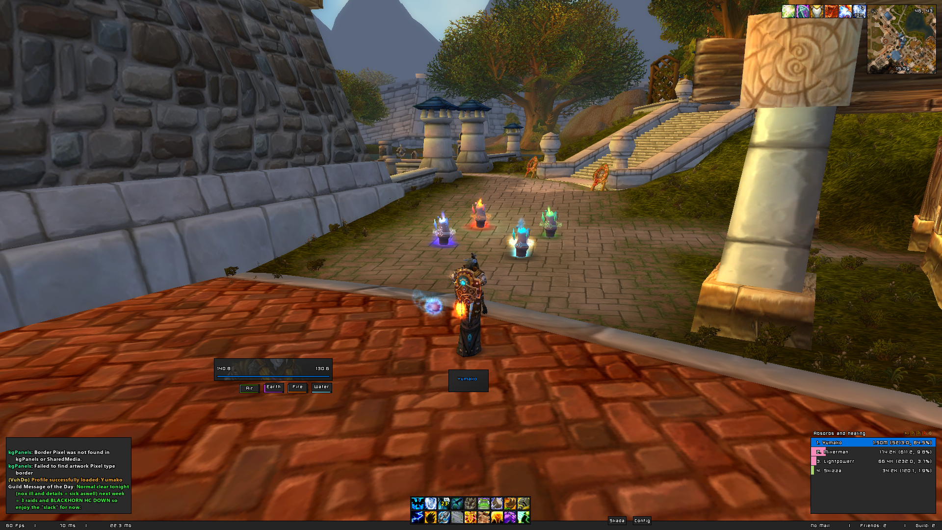
I'll update it with a raidscreenshot since I got a n1 Weak Aura tracker for Taste for Blood and you get to see my MSBT...but its almost everything on it. I didn't notice that Skada showed me on Nr. 1 but that wasn't on purpose
Comment appreciatedLast edited by mmocba105e19de; 2012-02-16 at 06:04 PM.
-
2012-02-16, 01:22 PM #6380DeletedThe picture is quite small 320x188 px hard to see Originally Posted by Brother

 Reply With Quote