 Limited PvP -> PvE Free Character Transfers
 Mythic+ Dungeon Adjustments - 27 April
 Affliction changes are alright, but specc still too clunky
 Is anyone successful on PVE moving strictly with click to move?
 MMO-Champion


Hey, what's the mod that gives you a different skin for recount / makes those pretty lines come out of some of your bars?Originally Posted by Raynfal

 Recent Blue Posts
 Recent Forum Posts
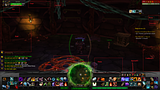
Thread: Post Your UI
-
2010-10-31, 09:32 PM #2501Grunt

- Join Date
- Oct 2010
- Posts
- 22
-
2010-10-31, 09:48 PM #2502The Patient
- Join Date
- Oct 2010
- Posts
- 242
KGPanels. I used it to create the boxes you see behind most everything. I reduced the alpha of Recount's and Omen's backgrounds down to 0% to show it. Originally Posted by metaphysics
The lines are created by another KGpanel with no background but a black border.
-
2010-10-31, 10:50 PM #2503High Overlord

- Join Date
- Jul 2010
- Location
- Clearwater Florida
- Posts
- 146
I've Edited my UI for both my tank/DPS spec and would like some feedback if possible on how it looks, anything i could improve.

This is Protection(tank spec) out of combat.

This is Protection(tank spec) In combat.

This is DPS spec out of combat.
- couple things to note, In this photo I have all power auras active and every Icon showing.

This is DPS spec in combat.
Hope you enjoy.Last edited by mmocba105e19de; 2010-10-31 at 11:06 PM.
-
2010-10-31, 10:58 PM #2504High Overlord
- Join Date
- Jun 2010
- Posts
- 120
Shadow priest ui:
http://i53.tinypic.com/v9xzp.jpg
Taken right after i got my Salty title
-
2010-11-01, 08:13 AM #2505Blademaster

- Join Date
- Apr 2008
- Posts
- 32
This is mine:

Last edited by mmocba105e19de; 2010-11-01 at 09:38 AM.
-
2010-11-01, 08:35 AM #2506Blademaster
- Join Date
- Jan 2010
- Posts
- 35
Recount?
Alvedon: how did you skin recount?
-
2010-11-01, 09:22 AM #2507High Overlord
- Join Date
- Oct 2007
- Posts
- 165
He didnt skin it, that's just a panel behind a transparent Recount. Originally Posted by Aves
-
2010-11-01, 09:34 AM #2508Field Marshal

- Join Date
- Oct 2007
- Posts
- 66
My holy paladin ui. Ive gone for a minimalistic look, and its still a work in progress. Atm im not happy with the minimap and going to skin/change it some. In a raid enviroment recount/omen pops up on the right corner, and in solomode i got the tradechat and other spam channels showing.

-
2010-11-01, 09:46 AM #2509Mechagnome

- Join Date
- Apr 2010
- Location
- In yer thread
- Posts
- 573
Last edited by mmocba105e19de; 2010-11-01 at 10:14 AM.

-
2010-11-01, 10:09 AM #2510Blademaster

- Join Date
- Nov 2009
- Location
- Netherlands
- Posts
- 38
my homebrewn UI!
I use it for all my chars, with corresponding classcolors obviously ^^
Idle:

Solo:

Raid:
maybe later :P
-
2010-11-01, 12:37 PM #2511Field Marshal
- Join Date
- Dec 2009
- Posts
- 87
"ImpUI"
Update to my current UI. Unfortunatelly I had to go back to Pitbull as oUF_Simple aren't updated yet (Iam kind of noob with .lua, Simple laylout was the only one I could modify to my needs).
Rest of AddOns used are quite light and simple as is the UI. I have no reason to push the MB used to absolute minimum, so there are some a bit fatter addons.
OOC,focus,pet,casting

Group,combat

AddOn list

Let me know any suggestion to make this better, or send PM with any question.Last edited by mmocba105e19de; 2010-11-01 at 01:53 PM.
-
2010-11-01, 05:10 PM #2512Scarab Lord
- Join Date
- Aug 2008
- Location
- Texas
- Posts
- 4,040
So I picked up some textures for a bottom bar, and decided to try to build a new UI with them. This is what I have so far. Trying very hard to stay away from the "Giant Bottom Bar of Doom" concept. :-)
The UF's are a tossof - I'm trying to find a UF concept that's "new", functional, and attractive, without being too large, goofy, or ugly. They're what I came up with last night in about 20 minutes, while dealing with a headache. :>
I would LOVE to get some comments and constructive criticism on the UF's, as well as the rest of the layout. Thank you very much. :-)

-
2010-11-01, 05:39 PM #2513Stood in the Fire
- Join Date
- Sep 2008
- Posts
- 445
The unit frames are definitely distinct. And I really like the party frame layout. I like the look of it, but I couldn't do it for functionality reasons. The data readouts on the bottom frame seems tightly bunched, though. Not sure if you'd considered moving 1 or 2 readouts to the corners. But I think it might give it some breathing room and balance. Originally Posted by Taryble
-
2010-11-01, 05:53 PM #2514Scarab Lord
- Join Date
- Aug 2008
- Location
- Texas
- Posts
- 4,040
I may consider spreading out the broker displays at the bottom a bit more, but probably not all the way to the corners. :-)
For "functionality", what do you think is missing? I plan on using the UI I end up with for levelling several toons (warrior, mage, druid, hunter), and for 5-mans and raiding on 3 others (the ones in my sig). I haven't gotten around to Raid frames yet, of course.
-
2010-11-01, 06:47 PM #2515Stood in the Fire
- Join Date
- Sep 2008
- Posts
- 445
By functionality, i was basically talking about my nit-picky setup. It absolutely wasn't meant as a knock on your UI. I only PvP. And I need everything set up in the play area so that I can keep an eye on the action while seeing frames. Originally Posted by Taryble
-
2010-11-01, 07:17 PM #2516Scarab Lord
- Join Date
- Aug 2008
- Location
- Texas
- Posts
- 4,040
Ahhh, okay. I wasn't taking it as a knock - I was like, "Wait, I missed something important? What is it? What did I forget to set up?". :> I was honestly asking - what does it NOT have that makes you think of it as "missing functionality."

-
2010-11-02, 06:50 AM #2517Blademaster
- Join Date
- Sep 2009
- Posts
- 33
In combat right after our Heroic LK Kill:

-
2010-11-02, 05:05 PM #2518Field Marshal

- Join Date
- Jul 2010
- Location
- Brighton/Swansea
- Posts
- 93

Information
Screen resolution is only 1280x768 because I'm playing on a ghetto system at the moment.
The main bar switches to other pages when shift and alt are held.
Idle

Party

Raid


-
2010-11-02, 05:09 PM #2519Banned

- Join Date
- Oct 2010
- Posts
- 9
Originally Posted by DerGenerale
WARNING! Site is not sife popped as red in WOT and Mcafee Siteadvisor!!!
Because a .jpg can give you any kind of virus.
Enjoy your vacation.
~ TreestonLast edited by mmocba105e19de; 2010-11-02 at 05:45 PM.
-
2010-11-02, 05:27 PM #2520Field Marshal

- Join Date
- May 2010
- Location
- Far far away... From you!
- Posts
- 91

Still got a little tweaking to do, but I'm quite happy with it. Wasn't able to get a shot from a raid. In a raid, you would see grid fully, DXE bars and scrolling combat text. You would of course see debuffs on target aswell along with target's target (same placement as my focus target, but on right side instead)
Everything is set up from scratch and it's my first attempt at creating my own UI.Last edited by mmocba105e19de; 2010-11-02 at 05:45 PM.

 Reply With Quote


